LEMTRADA Field Force Mobile App
Creating a mobile app that easily shares assets and resources between sales reps and physicians.
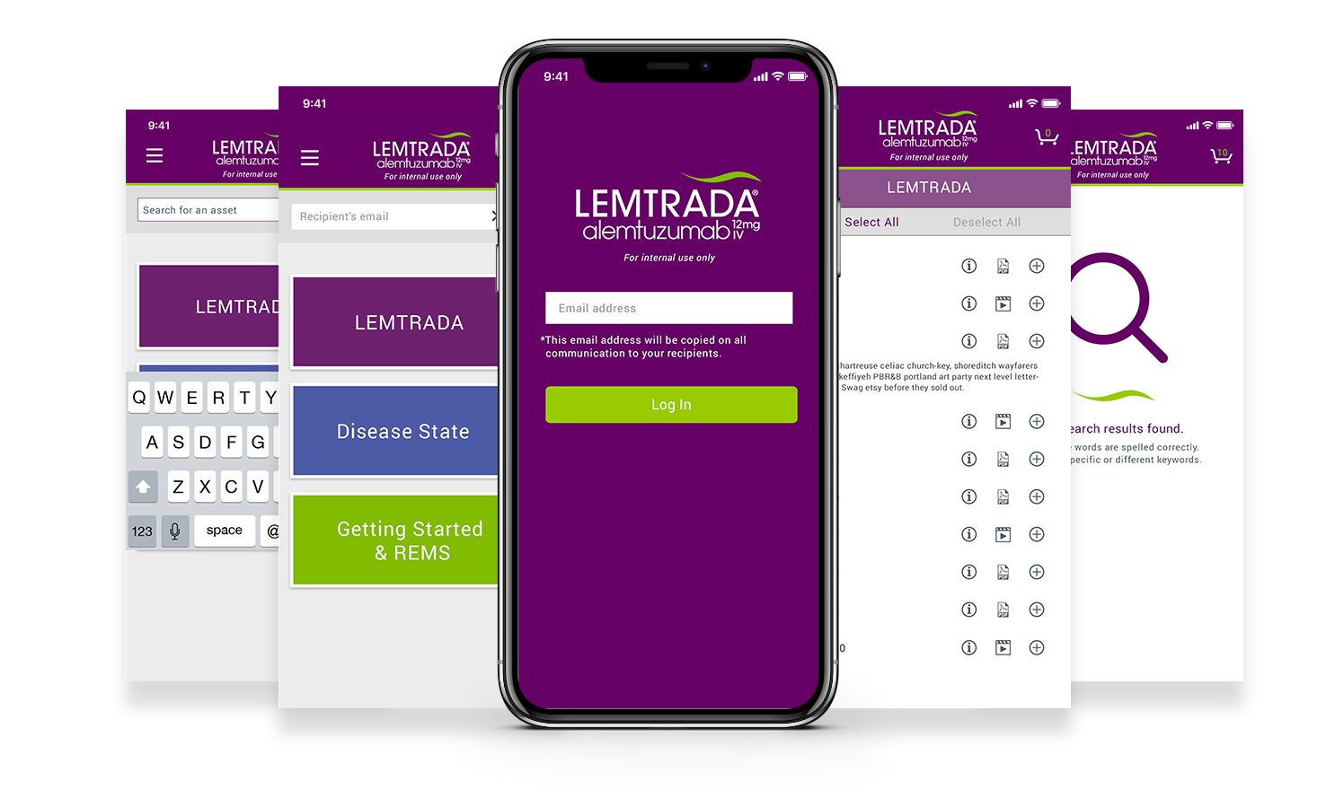
Creating a mobile app that easily shares assets and resources between sales reps and physicians.

The Field Force Email App is a tool for sales reps. It offers an easy way to share brand resources and information with customers. It can be used during a meeting or conversation with minimal disruption.
My team and I were presented with the task of creating a smartphone solution for the sales force to utilize with their customers without disrupting dialogue with customer. We needed to provide the ability to launch multiple asset libraries, view/sort the assets by topic(s) and mix of media assets, and provide utilization and tracking data.
My team and I worked closely with the field force to determine pain points and craft solutions
I collaborated with the UX Design Lead to create wireframes and functional annotations to obtain client and field force approval
I developed the visual design based on the existing branding elements to create a beautiful and functional user experience
I crafted interactive prototypes using InVision for internal team approval and client sign-off
The idea for the Field Force Email app came from a series of interviews between my team and the Field Force sales representatives. We discussed obstacles the sales reps encountered during sales meetings with physicians. We learned they frequently needed to share sales materials with customers, but doing so was often disruptive to their conversation.
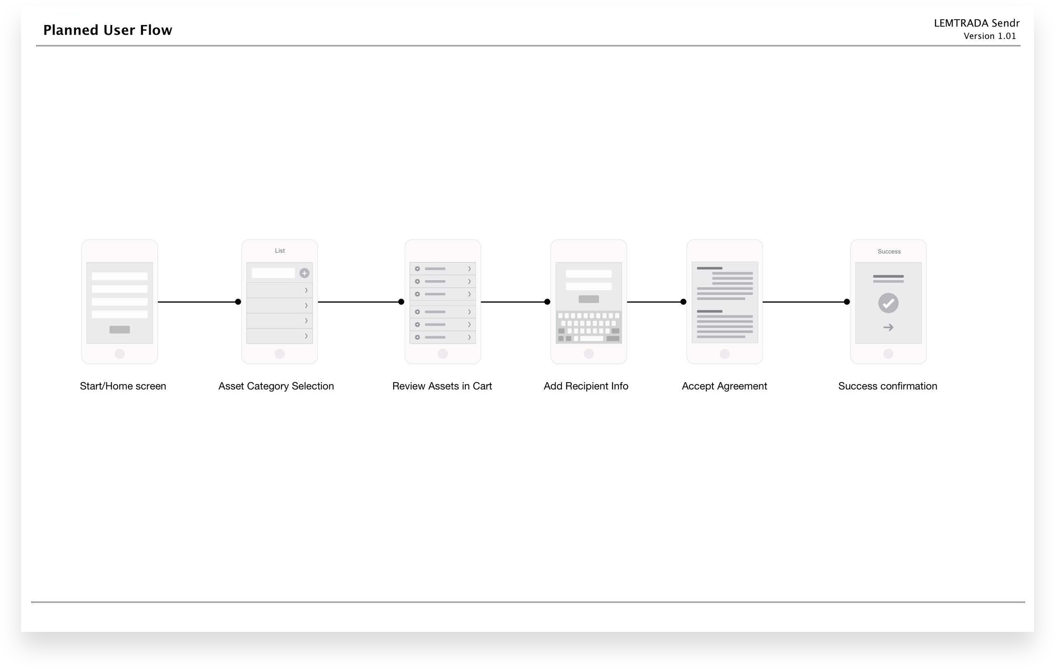
Wire framing was a collaborative process between myself, strategy, and UX. We began by focusing on user flows, to quickly identify problems and opportunities within the user experience.
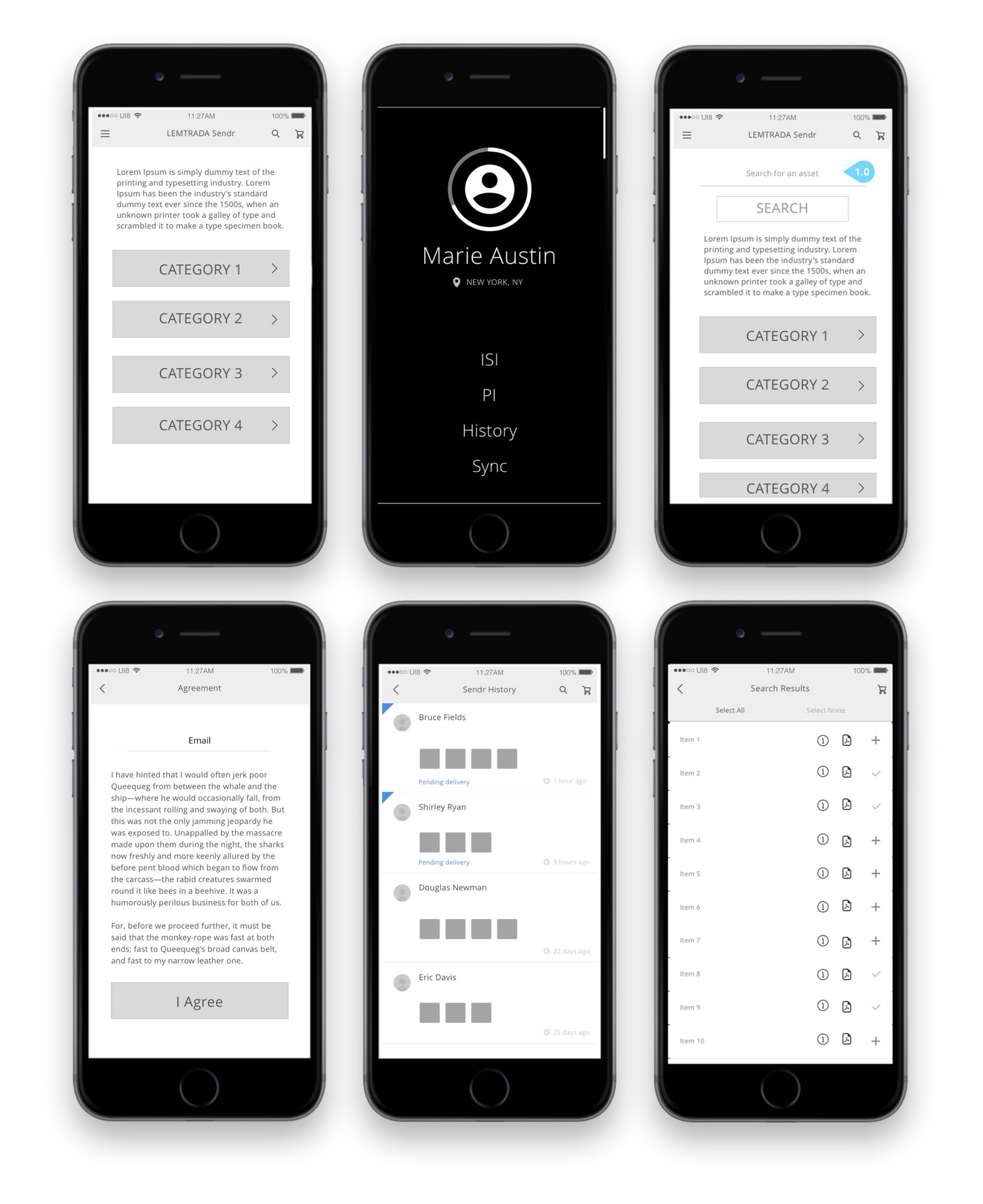
Once the wireframes were set, I worked out the visual design, which needed to incorporate LEMTRADA brand elements. Ease-of-use was the primary goal with the design—for example, large buttons that offered a large “touch target” and could be identified at a glance, since the app is intended to be used during a conversation.
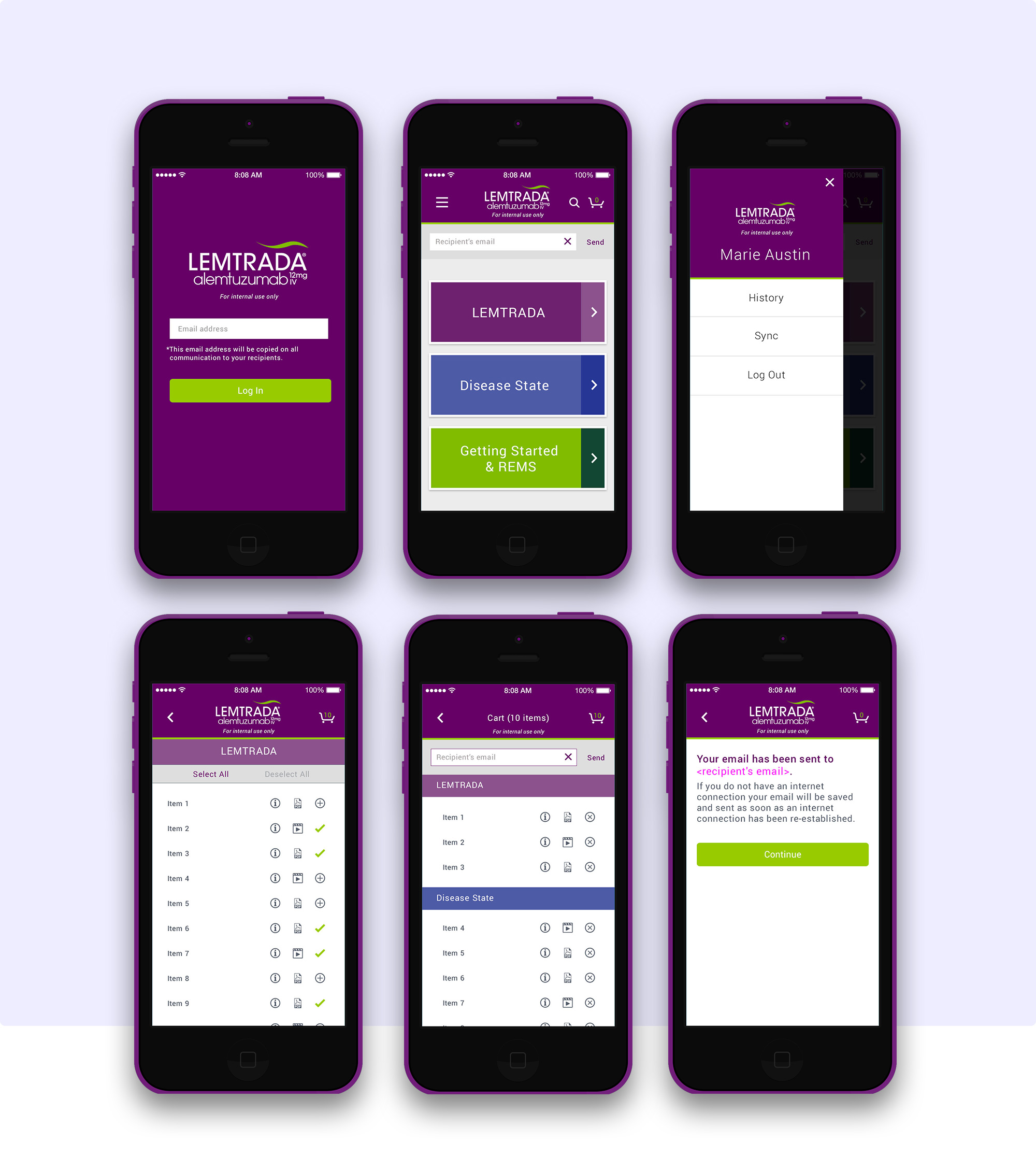
In addition to InVision prototypes, my team prepared a video walkthrough to demonstrate how the mobile app functions in real time.
As part of the asset delivery protocol, responsive emails caputuring field force item selection are deployed. One landing page for all customers was proposed for Phase 1. Future landing pages potentially customized based on target-types (ie "currently prescribing" "considering") were also discussed with the client and their field force.

The visual design documents and prototype were handed to the Front-End/Back-End development team. The screens were designed to be scalable and fit within the agency's integrated solutions platform so that the production services team could easily add more content without the need for the design team to be involved. This efficient process streamlined and reduced the amount of work for the team during post-launch updates.
We delivered a high-quality solution that supported the goals of individual Field Force sales reps, the business objectives, and created a better experience for our client's customers—physicians. Once the app was in the field, our analytics team gathered data that would inform future iterations. Finally, our production process served as an easy-to-replicate model for additional asset-sharing services.