FastSolar Energy Quotes
The process for enhancing and improving a solar energy quote website.
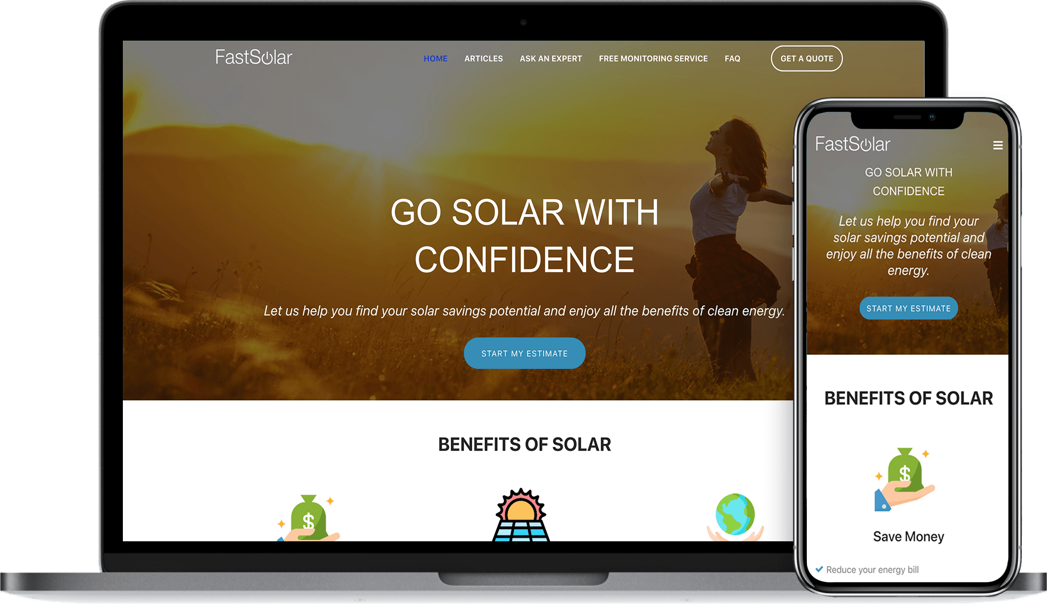
The process for enhancing and improving a solar energy quote website.

FastSolar helps solar energy customers take the first steps toward understanding their solar savings potential. With solar you can produce your own electricity, reduce your energy bill and shrink your carbon footprint.
User research indicated that the previous Squarespace platform led to a high abandonment rate. Users reported being put off by the large "GET A QUOTE" call to action and unclear organization of content.
Exelon Energy, the client, needed a website that would provide useful information that customers were seeking and establish FastSolar as a trustworthy source of solar content. As the only Experience and Visual Designer on the project, I was tasked with analyzing and reorganizing content to be presented in a much more helpful and useful manner to meet customer needs and business goals.
I worked closely with the executive team to determine pain points and learn overarching business goals.
Utilizing marker and paper, I sketched wireframes to obtain stakeholder approval before heading into design
I designed layouts based on the approved sketch concepts featuring a soothing color palette and clean typography
I crafted interactive prototypes using InVision Studio to demonstrate functionality for stakeholder approval and sign-off
I conducted phone and Skype interviews with the stakeholders to determine their perspective of user needs, corporate business goals, and then align them to project objectives
The urgency of quick user testing and short turnaround time for this project required me to quickly develop marker and paper sketches for stakeholder approval. I solved some user experience problems, such as content strategy and navigation reorganization, right in the sketches by creating 3 total options and then shared with the team for instant feedback and approval. Upon initial wireframe approval, I proceeded to develop visual designs for all three options in InVision Studio.
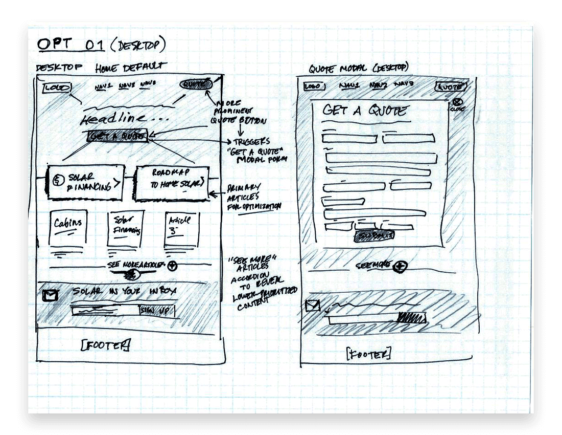
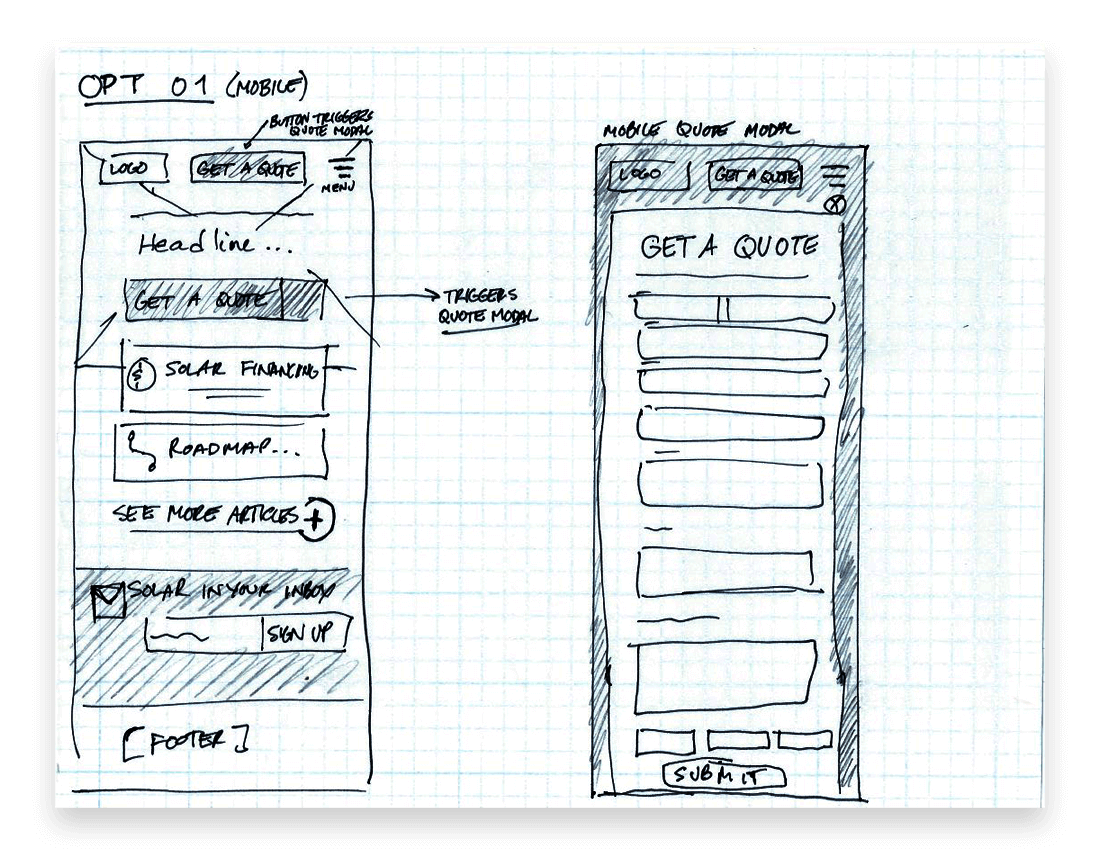
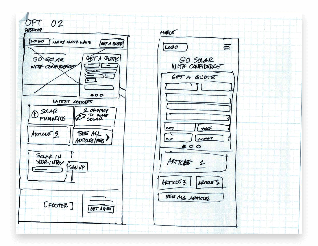

The first round of visual design, interactions, and basic prototypes were created using InVision Studio. Turnaround time was about 2 days, working with the 3 client-approved wireframe sketches. I utilized soothing sky blues and warm yellows of the sun to create a comfortable mood for the interface elements. Imagery was provided by the client.
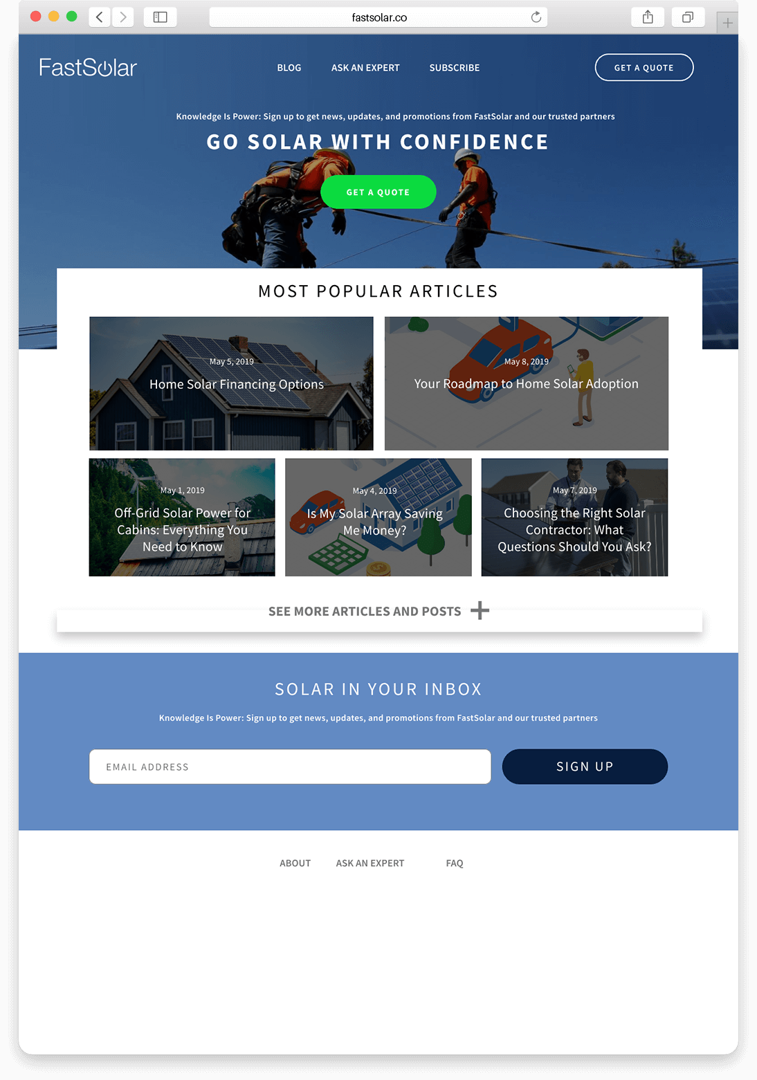
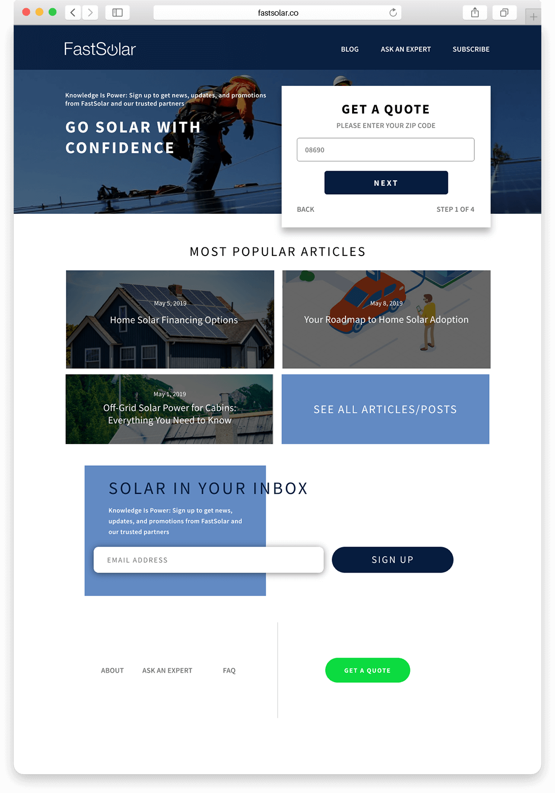


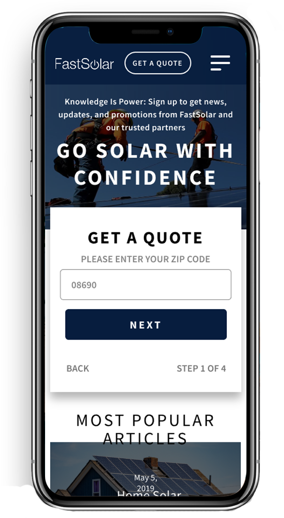
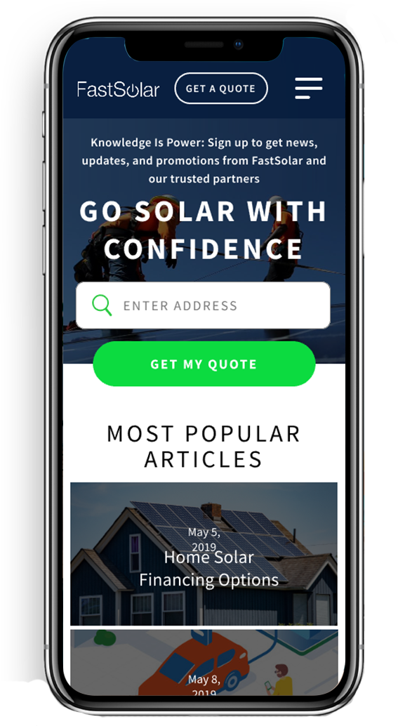
Upon receiving feedback from the stakeholders, we then proceeded to conduct user testing and customer interviews via telephone using the InVision prototype designs from Round 01, which would inform our design decisions moving forward.
We gathered very insightful feedback, criticism and user input including articles and content that were most important to the customer, changing the call-to-action from "GET A QUOTE" to "GET STARTED", and suggestions for organizing and presenting important information more prominently.
Once we processed the feedback collectively and aligned it to business goals, I updated the designs to incorporate all of the changes. The new design tested very well amongst users and I then proceeded with preparing the layouts for the CMS build.
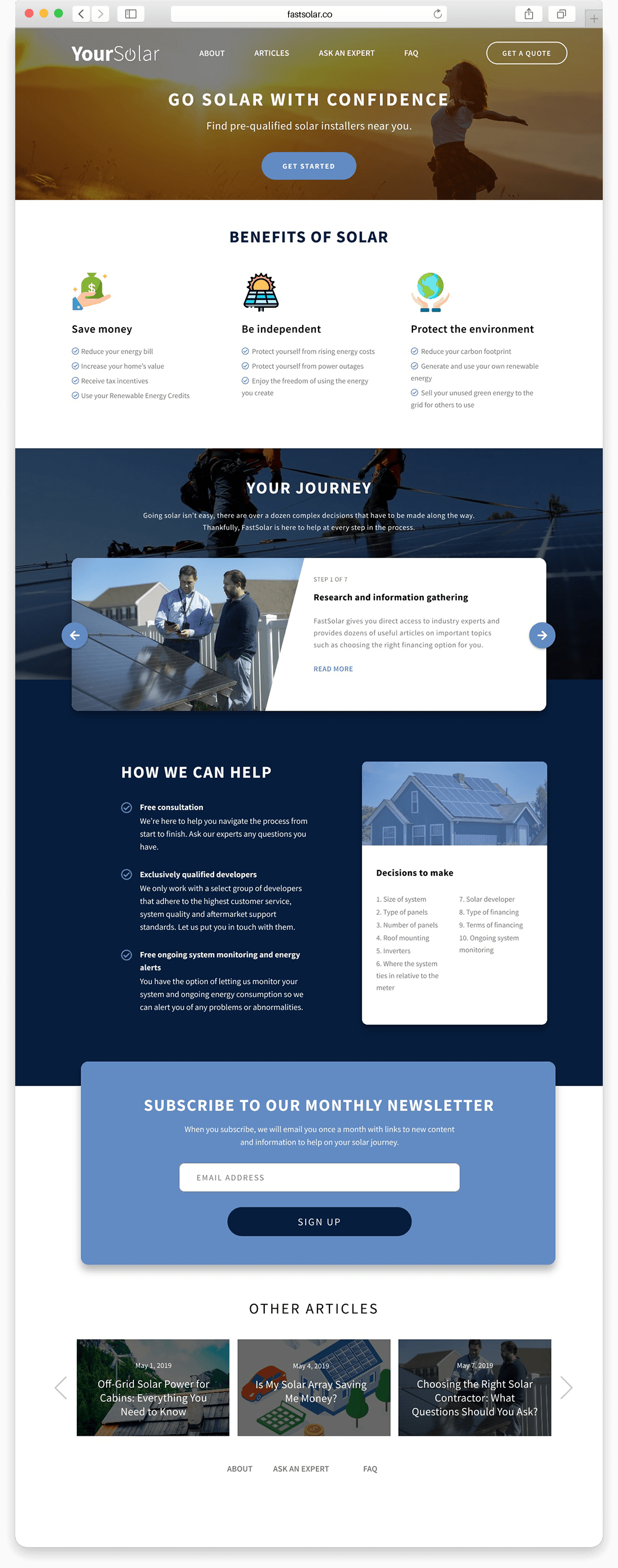
I approached this project with an understanding that I would be providing design templates for the CMS builder. Since there was no InVision Enterprise account available on the project, I provided all styles, images and InVision Studio files, including prototypes, to the CMS builder for handoff.
It is important to note that some features of my design including fonts, some colors, and UI treatments did not make it into the current CMS build due to development issues. I was able to compromise a few small design elements in order to help satifsy the time sensitive nature of the project.
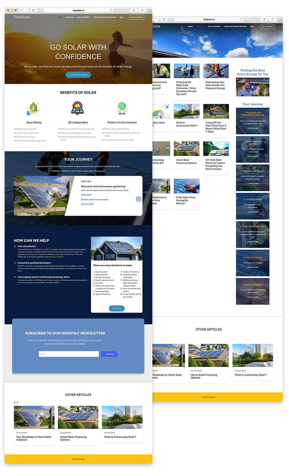
The FastSolar website redesign launched in June 2019. The team not only delivered a much improved customer experience, but more importantly, one that truly satisfied user needs. My involvement from initial stakeholder conversations through handoff created a strong foundation for the entire project lifecycle.
The team's attention to user feedback resulted in delivering an experience that increased customer trust and established FastSolar as a reliable source of solar energy content in a very crowded marketplace. New features including the customer journey carousel provided a clear step-by-step process for consumers considering a switch to solar energy.