The Asthma Control Test
Redesigning the online global asthma exam.

Redesigning the online global asthma exam.

The Asthma Control Test™ was designed by a team of asthma experts and tested on hundreds of asthmatic patients. It provides patients and their doctors and nurses with a useful score which will help them determine the level of treatment required.
User research indicated that the confusing test experience lead to a high abandonment rate. Users reported being overwhelmed by the number of questions on screen and unsure how to proceed with their test score.
GSK needed a website that would clearly communicate to patients and doctors how to take the exam, make the exam itself easy to navigate and complete, and provide clear instructions on how patients can share the test results with their physicians. Because the test would need to be translated into several languages for a worldwide audience, placeholder copy was used during design.

I analyzed user insights and worked with the UX lead to convert the analysis into usable data for redefining the experience
I collaboratged with the UX lead in London to create interactive wireframes in Axure and test the experience both internally and with the clients
I created visual designs based on the approved wireframes and established branding which introduced soft gradients and clean typography to create an inviting user experience
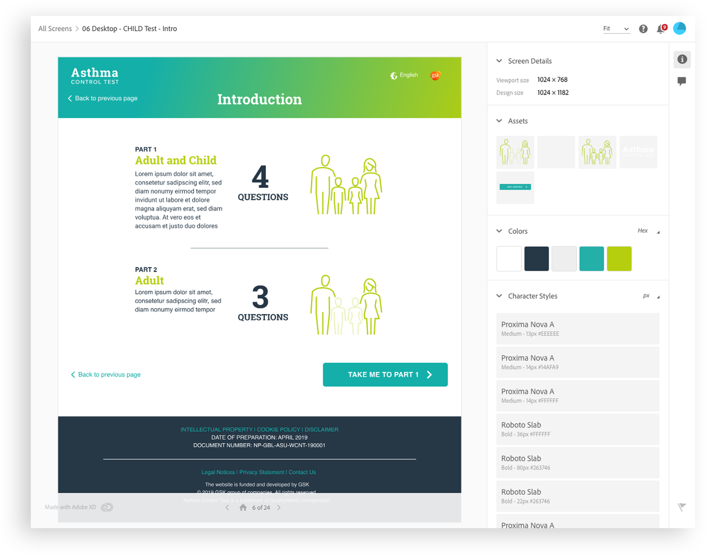
I crafted interactive prototypes using Adobe XD for internal team approval and client sign-off
Working alongside the lead UX Designer in London, we analyzed the feedback of over 100 users and discovered more than 50% didn't understand how to complete the Asthma Control Test. Additionally, the small group that did complete the exam had no idea what to do with their test results.
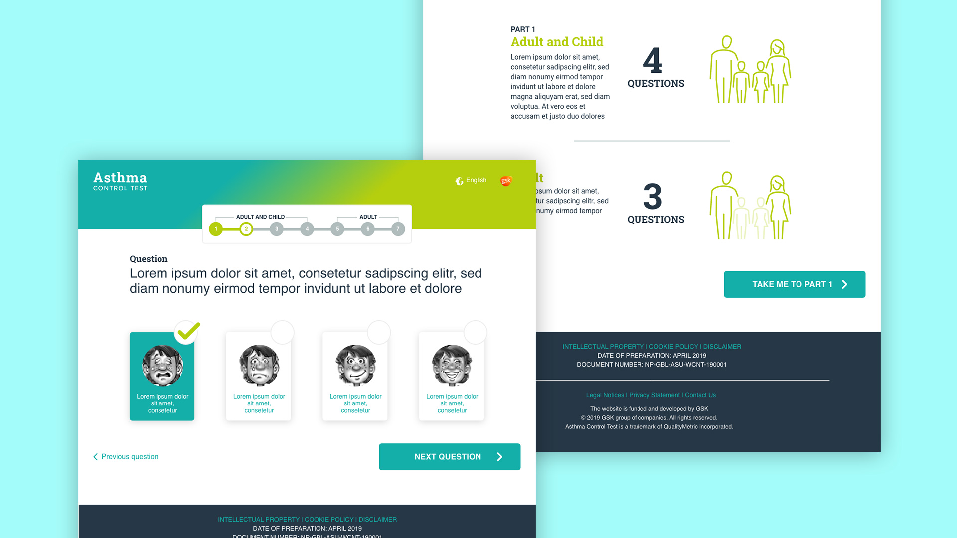
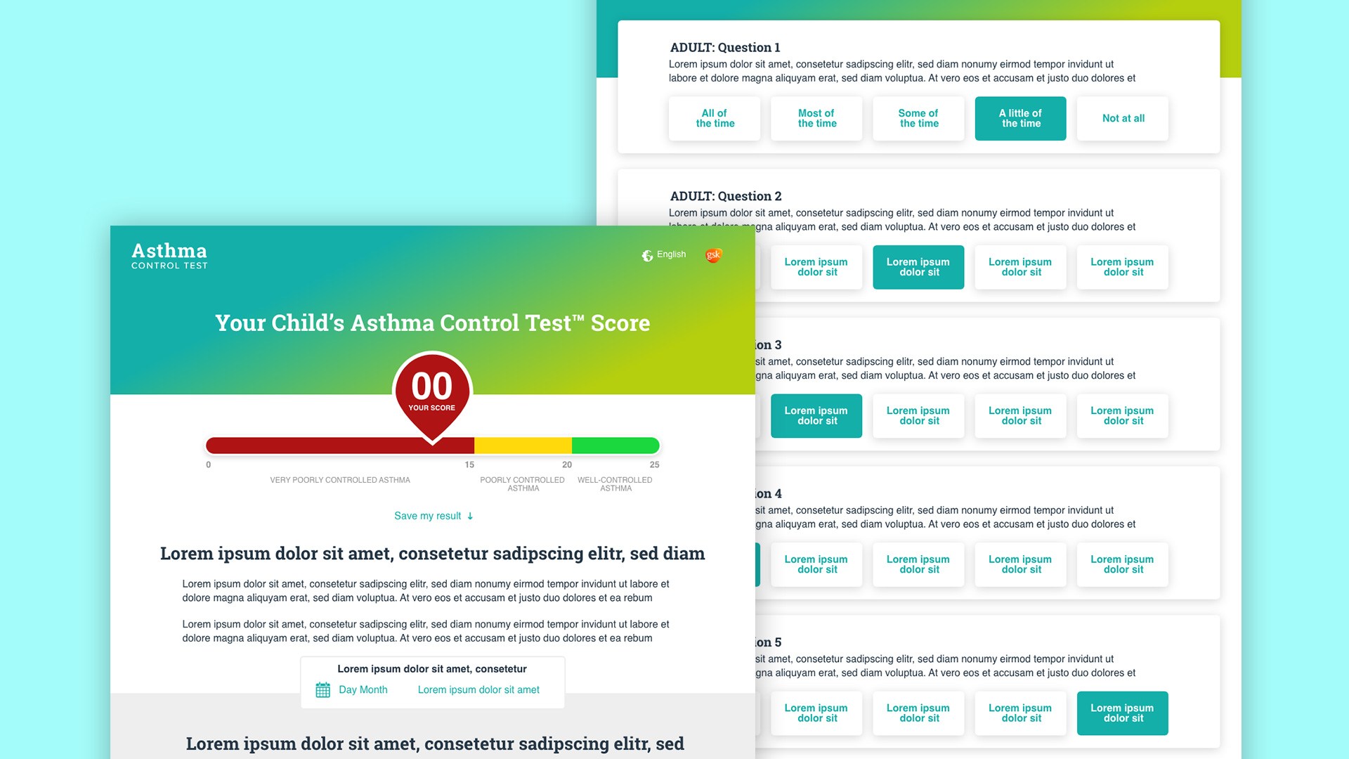
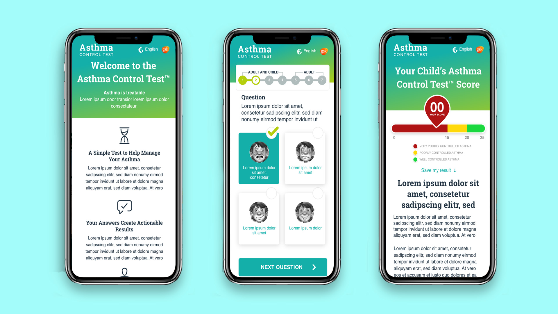
We then proceeded to ideate and develop low-fidelity wireframes that clearly presented the introduction, identified the testing paths, organized the questions into digestible content, and clearly explained the meaning of the results and how they could be shared with a doctor.

Visual design was created using Adobe XD. Turnaround time was about 3 days, working with client-approved wireframes. I utilized the existing primary teal color and introduced additional colors, like the navy and lime green, to create a comfortable mood for the interface.
Given the multilingual nature of this project, I also designed new icons to help users understand the test at a glance. These include the icons for the Adult and Child Test, the Adult test, and the home page intro icons. The goal was to highlight the new features while creating something that fit alongside mandatory requirements like the face scale.


This project was approached from a mobile first perspective as reports indicated 70% of the current traffic was mobile users. The question and answer interface especially needed to be simplified enough for a highly-focused mobile experience.

While bringing the wires to life in the form of interactive prototype templates, I prepared the Adobe XD files for developer handoff using XD's built-in Design Specs feature . I specifically created each page template to utilize modular, reusable elements, considering how each template might be translated into various languages throughout the world. This process provided everything the development team needed while reducing development time and build discussions.

A major takeway for me on this project was learning I have a strong collaborative ability working with folks overseas. The use of tools like Skype for Business for screen sharing, AdobeXD for demonstrating designs and interactions, and simple phone conversations allowed my team and I who were separated by the Atlantic Ocean to resolve the problem and deliver a best-in-class solution.
The newly redesigned Asthma Control Test global website launched in 2020. The prototypes I prepared have been tested in global markets with success. The customer interviews and client conversations collected and applied to the reimagined experience resulted in conneting patients and their families with meaningful asthma test results they can share with their healthcare practioners.